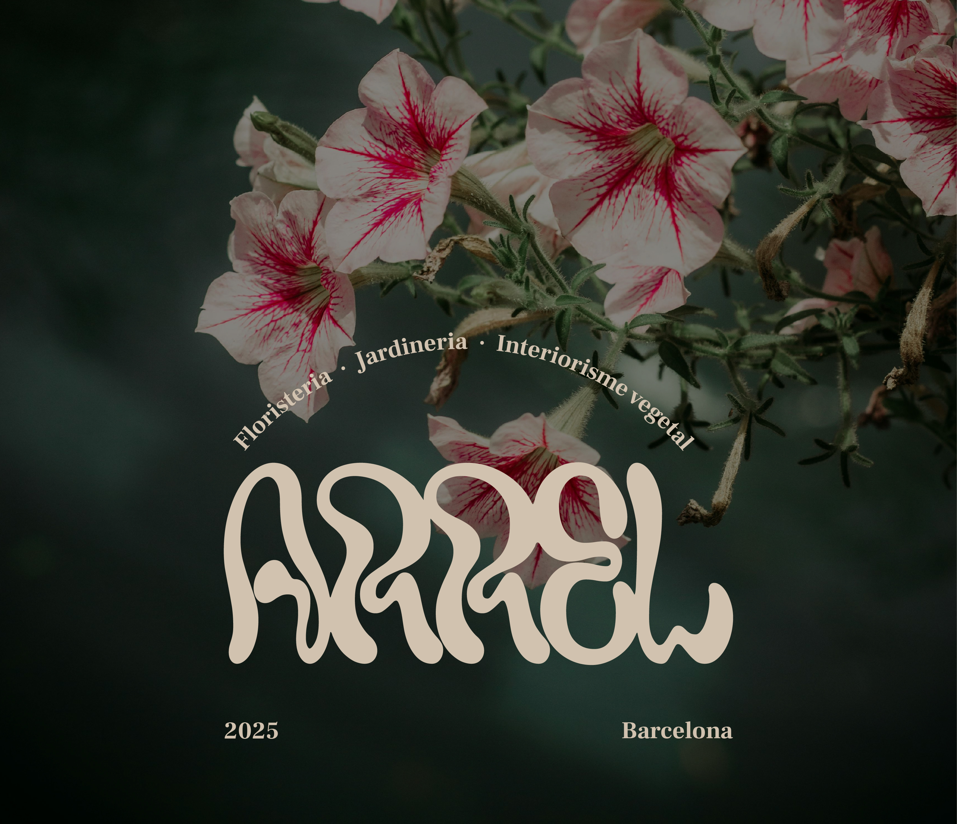
A fictional visual identity project for a florist and garden centre specialising in decoration, named "arrel" — the Catalan word for root.
Deliverables: visual identifier, complete brand identity, business cards, patterns, social media post designs, interior and exterior signage, and workwear.
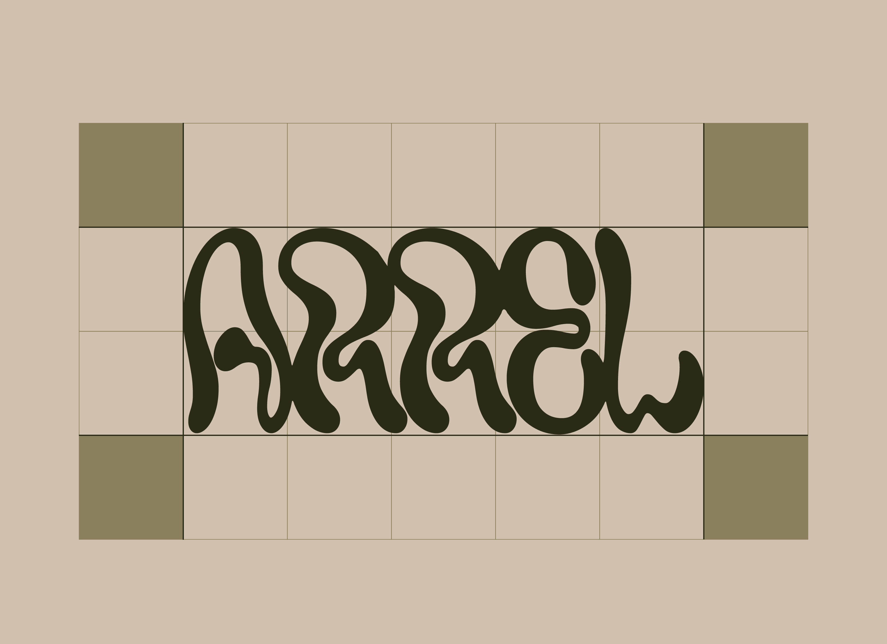
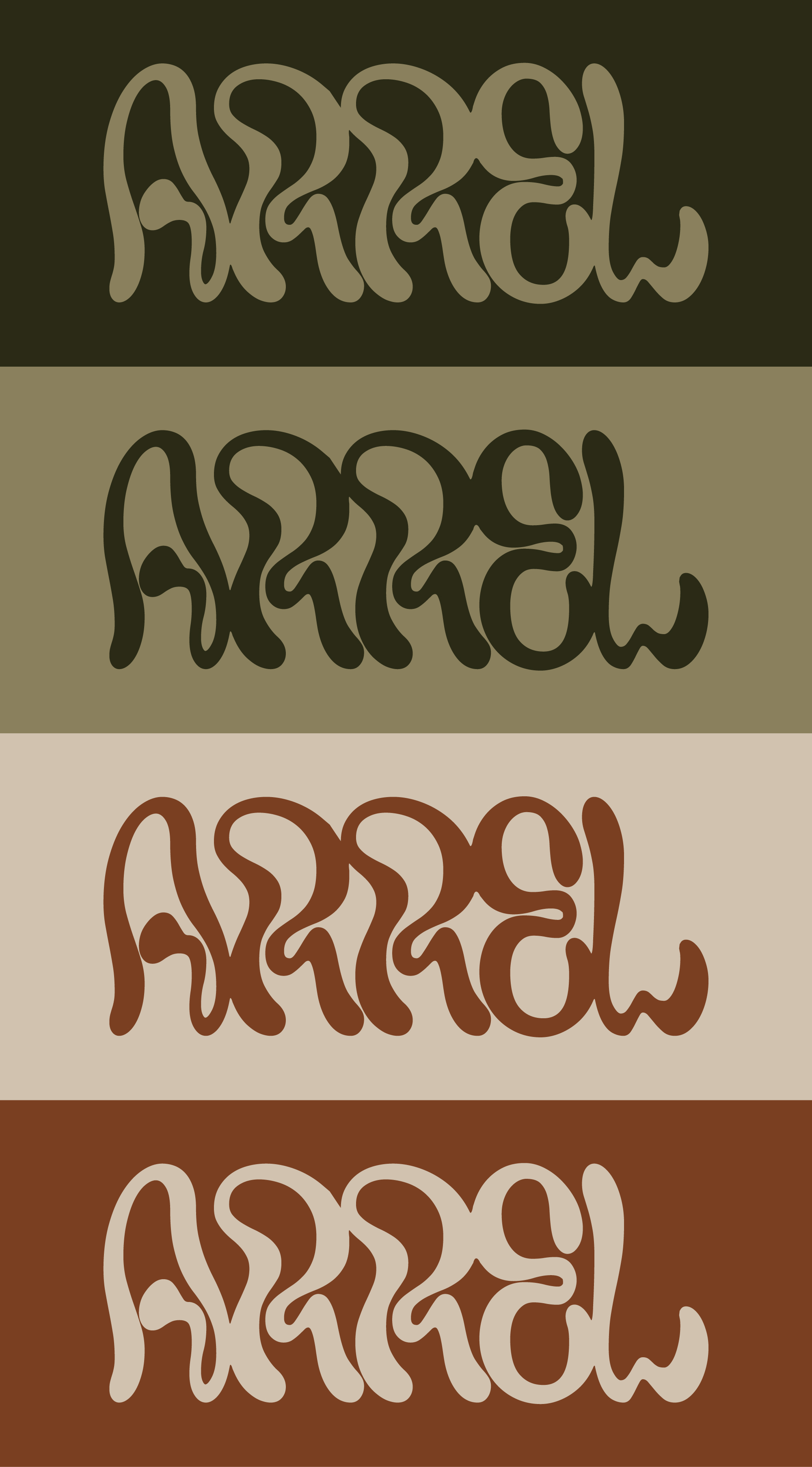
The logotype was designed to look grown rather than constructed. Rounded letterforms reference roots and tendrils while remaining scalable and legible. Four colour variations allow the mark to adapt across different surfaces and contexts.
The colour palette draws from the earth — olive green, warm terracotta, and pale cream referencing the physical world the brand represents.


For the physical brand applications, a network of delicate roots was introduced to complement the logotype. Fine and understated, the motif does not compete with the logo — it supports and extends ARREL's visual world.
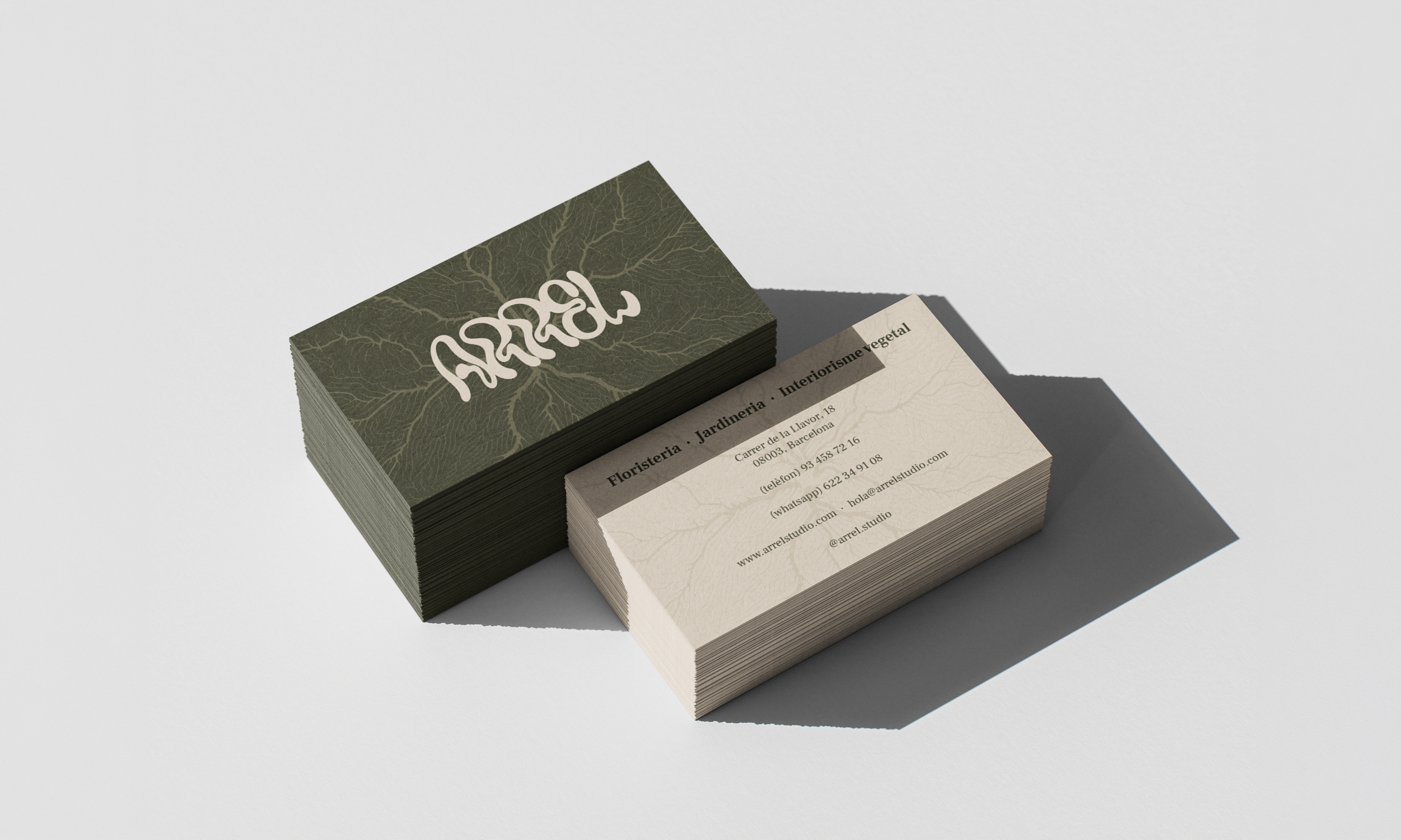
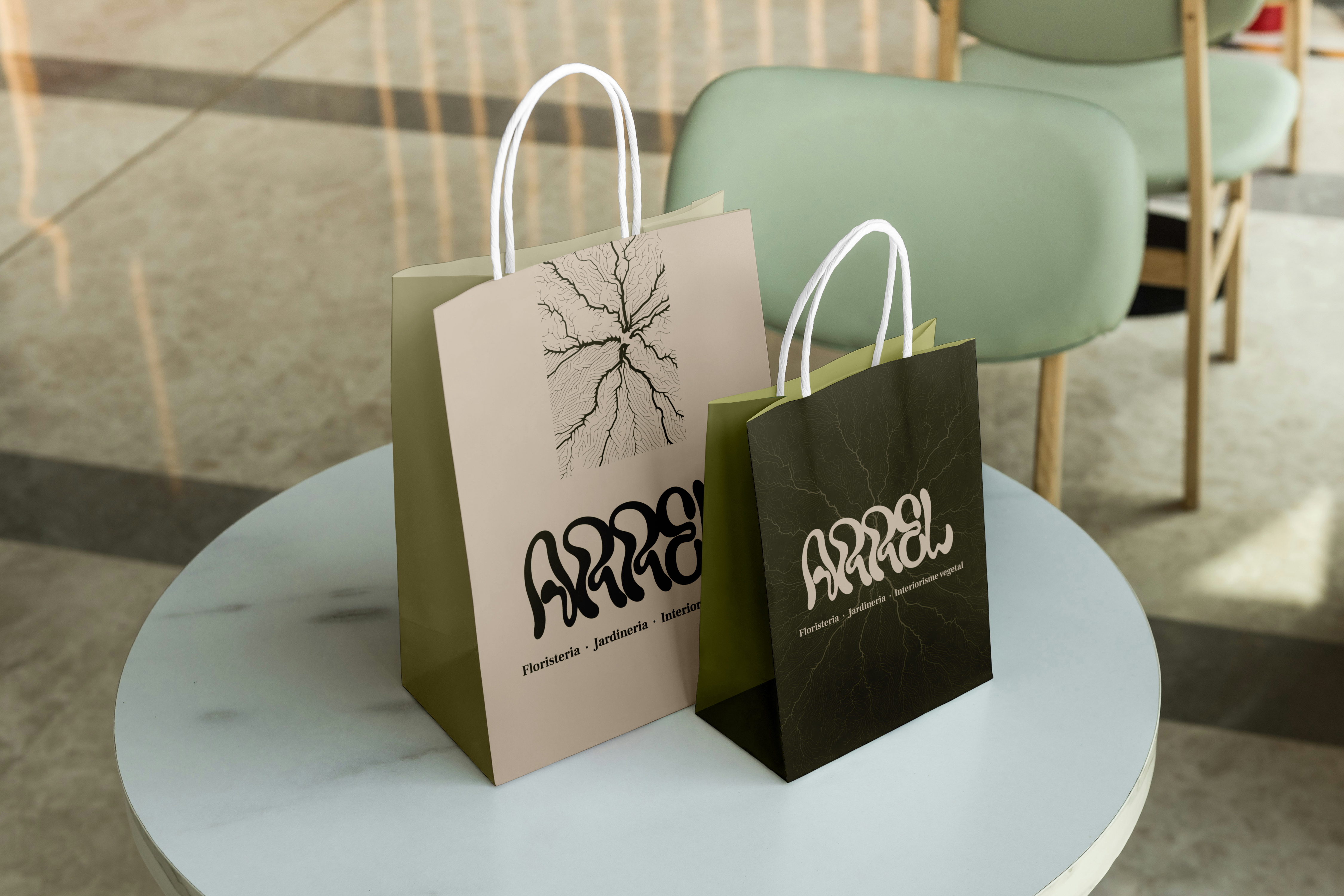
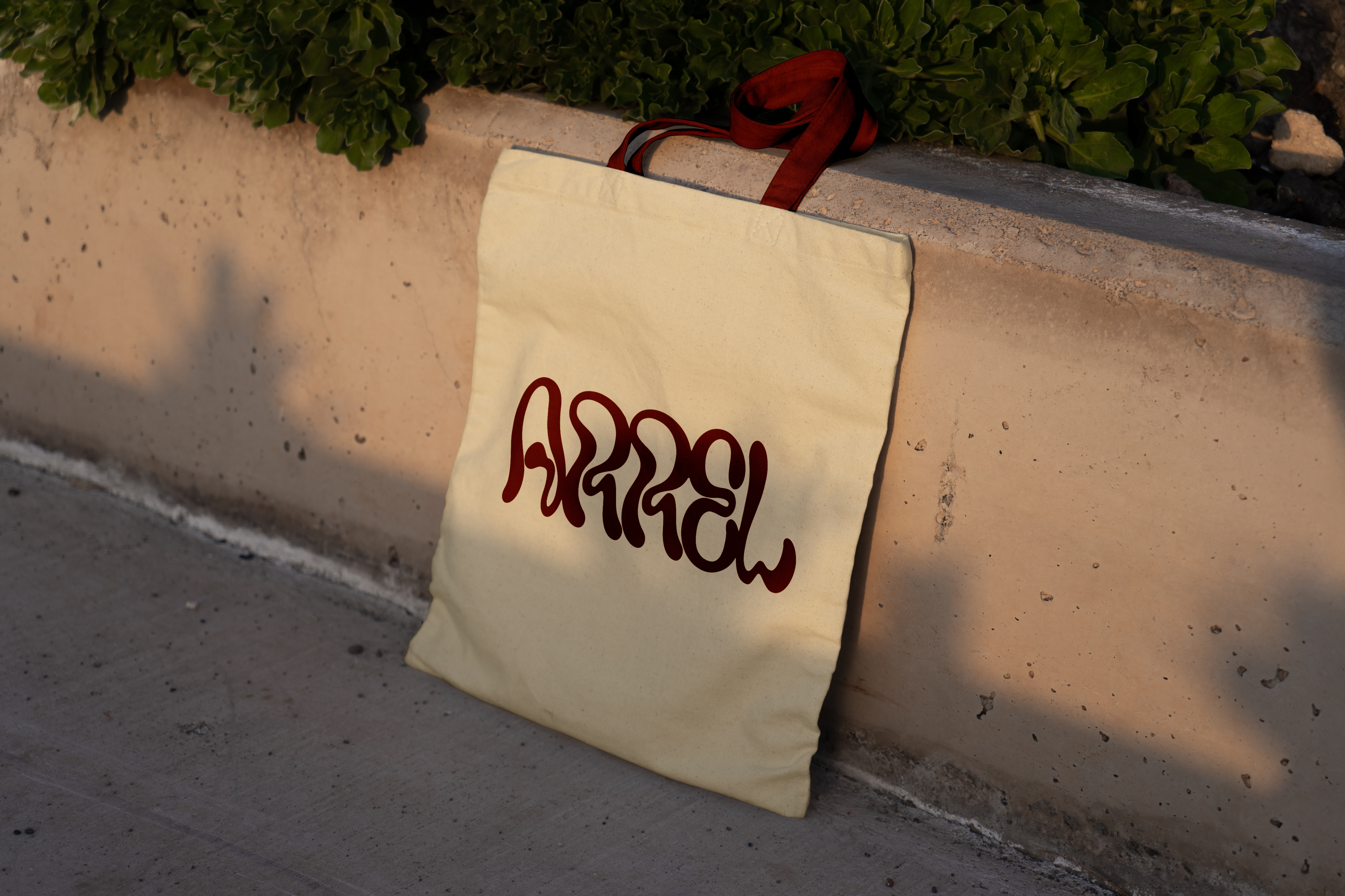
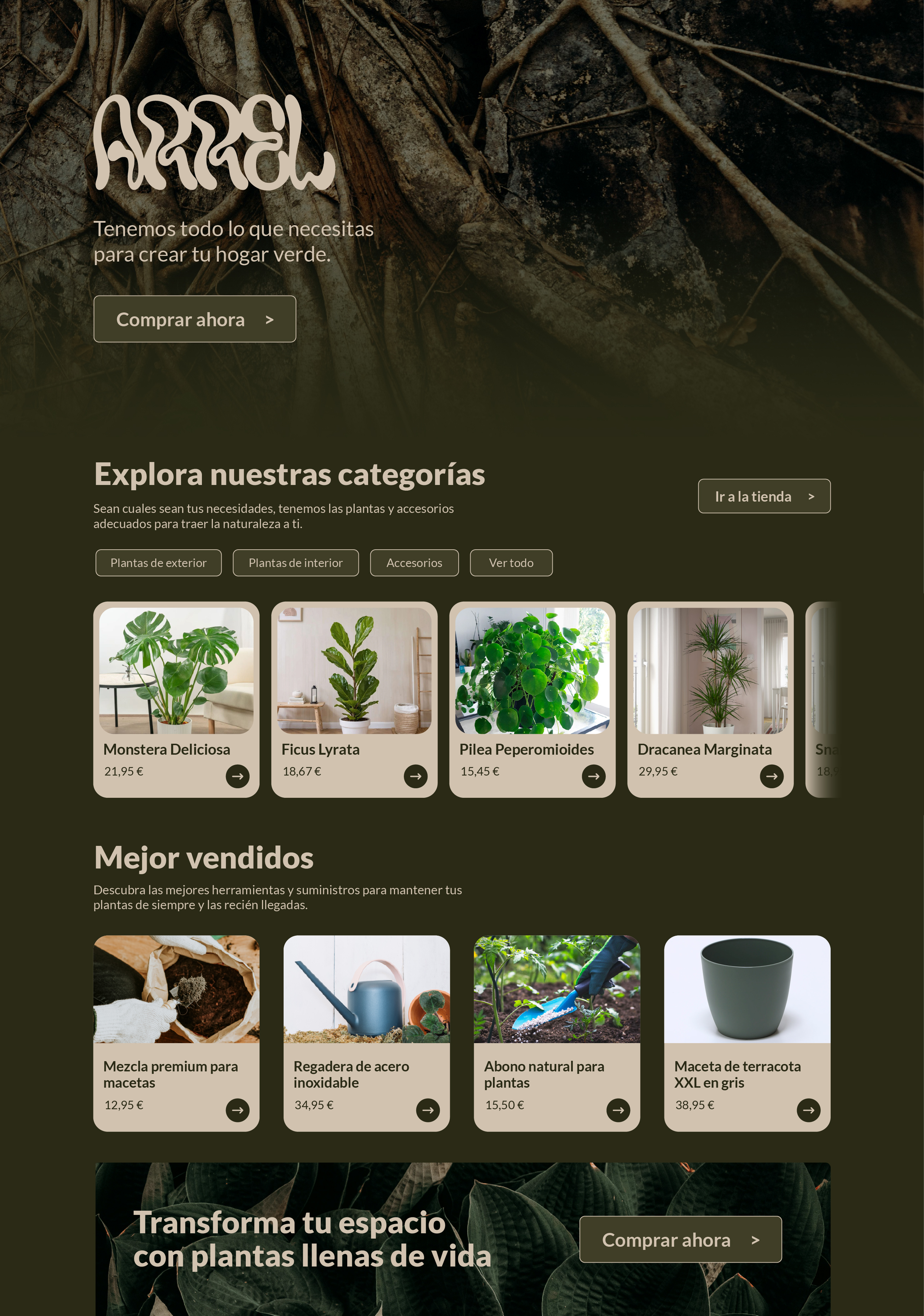
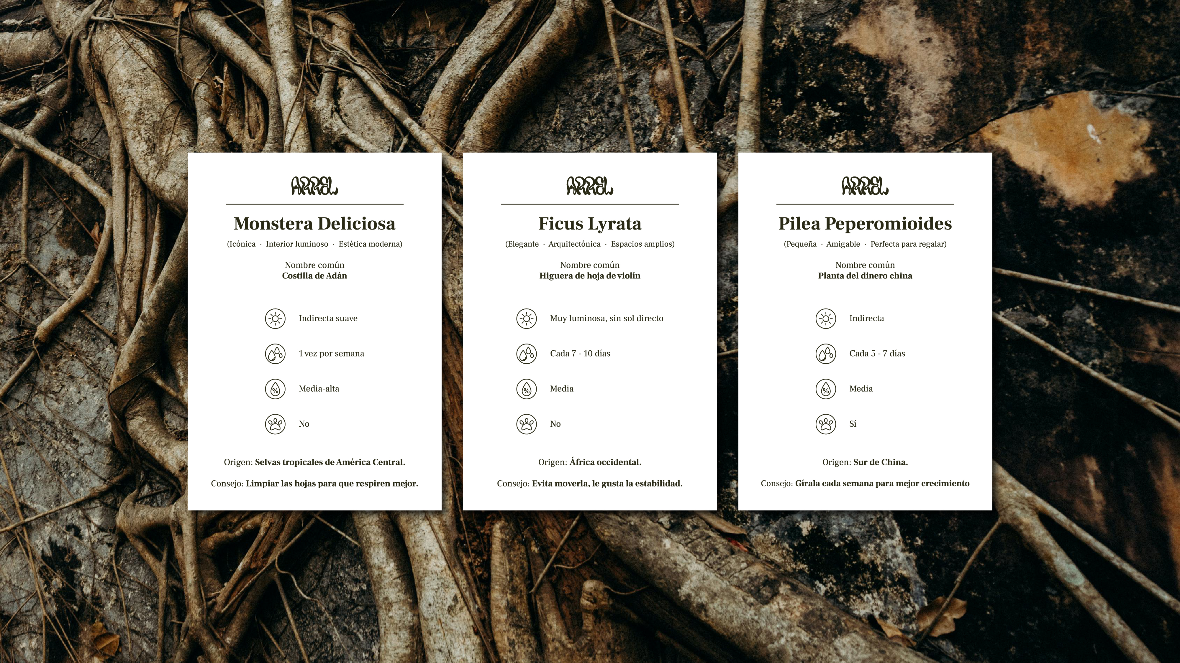
The identity was applied across every touchpoint: embossed business cards and individual plant-care cards, a botanical repeat pattern for packaging and tote bags, social media templates including plant-profile cards, and interior and exterior signage.
A web design concept was also developed, carrying the organic visual language into a digital space with a deep olive palette and generous white space.