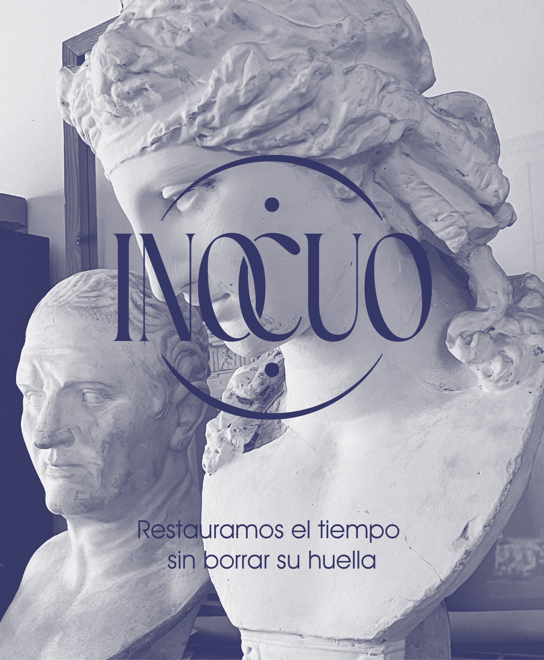
Inocuo is a personal redesign of the visual identity for a company specializing in the restoration of antique pieces of all types and materials: paintings, furniture, photographs, stained glass, documents, and stone sculptures.
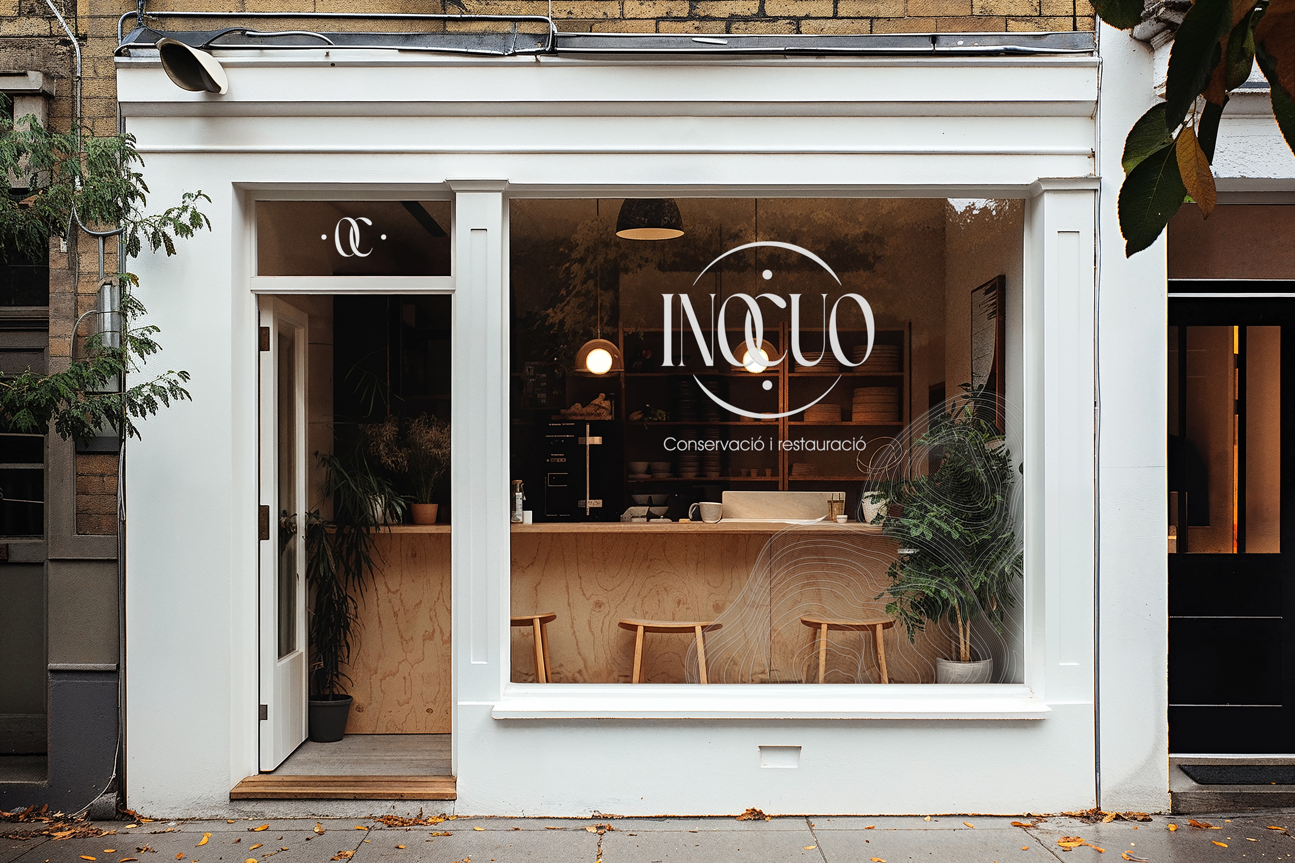
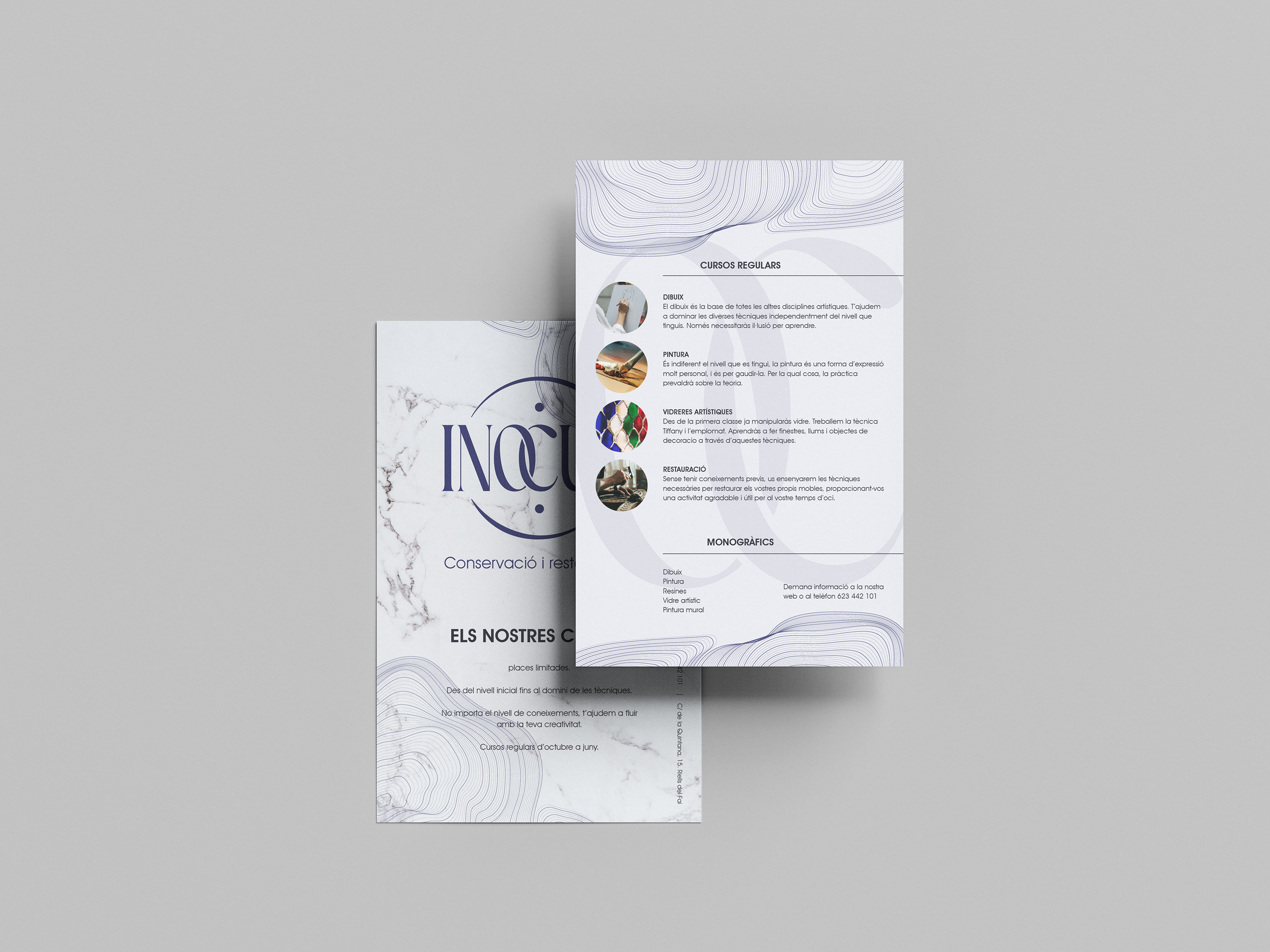
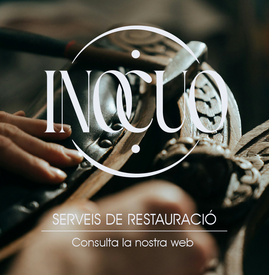
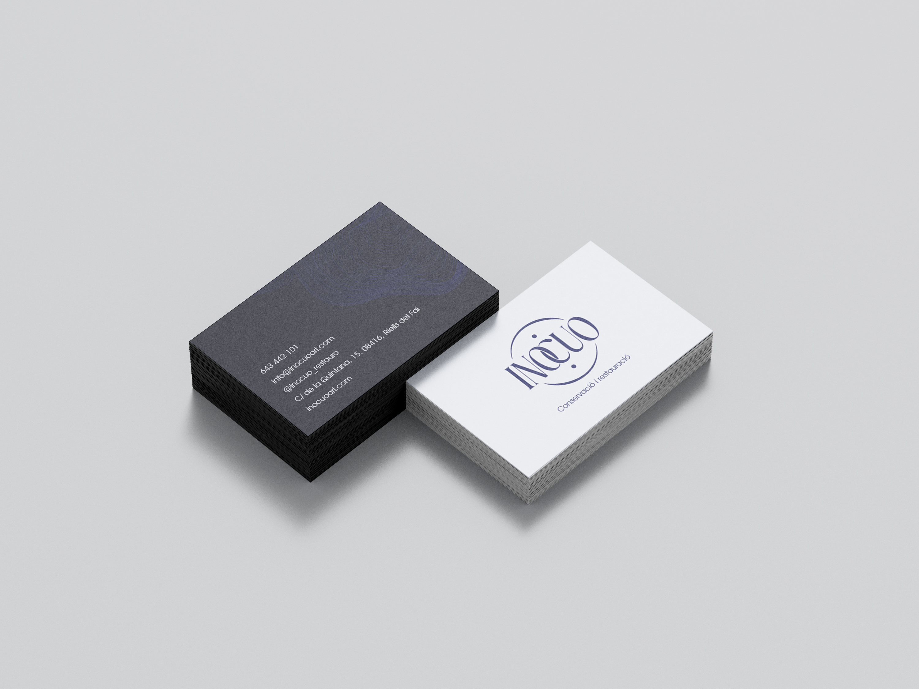
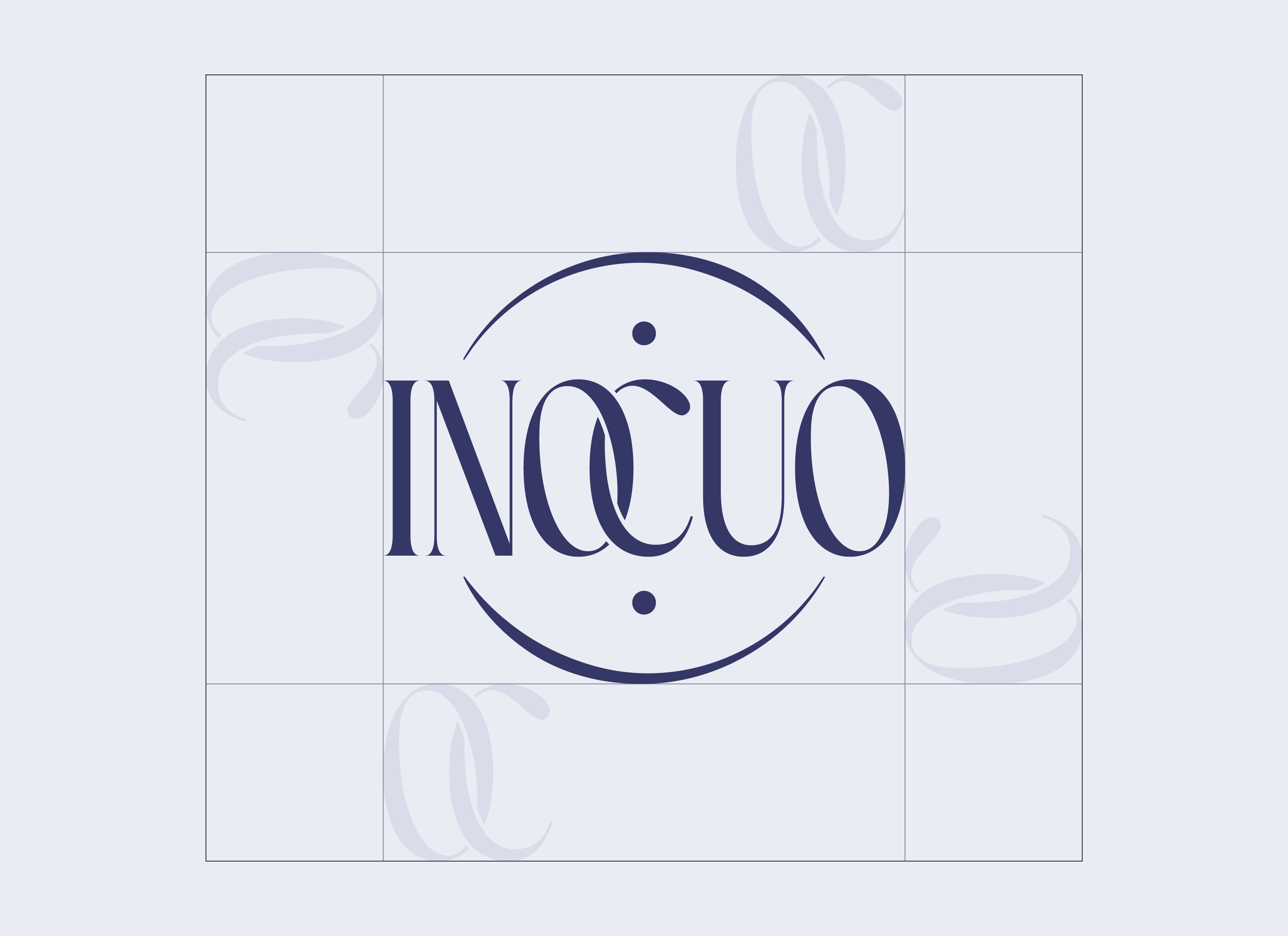
The project I set out to create was a more refined and elegant identity that communicated both craftsmanship and modernity. The resulting logo—a serif typeface framed in a circle with the two central letters (OC) intertwined—evokes precision, elegance, and timelessness, qualities that underpin every restoration.
The circle enclosing the logo evokes continuity, care, and the cycle of preservation, revitalizing classic forms. The client chose the blue color, which was then complemented with dark gray and white—classic marble colors—to convey timeless authority with a clean, contemporary finish.
The monogram variant—two intertwined letters—offers a versatile secondary brand for contexts where the full logo would be too complex.


The identity extended to business cards, course and service brochures, exterior signage, window vinyls, interior signage and corporate stationery, as well as digital designs for social media or online promotions, creating a complete visual ecosystem for the brand.