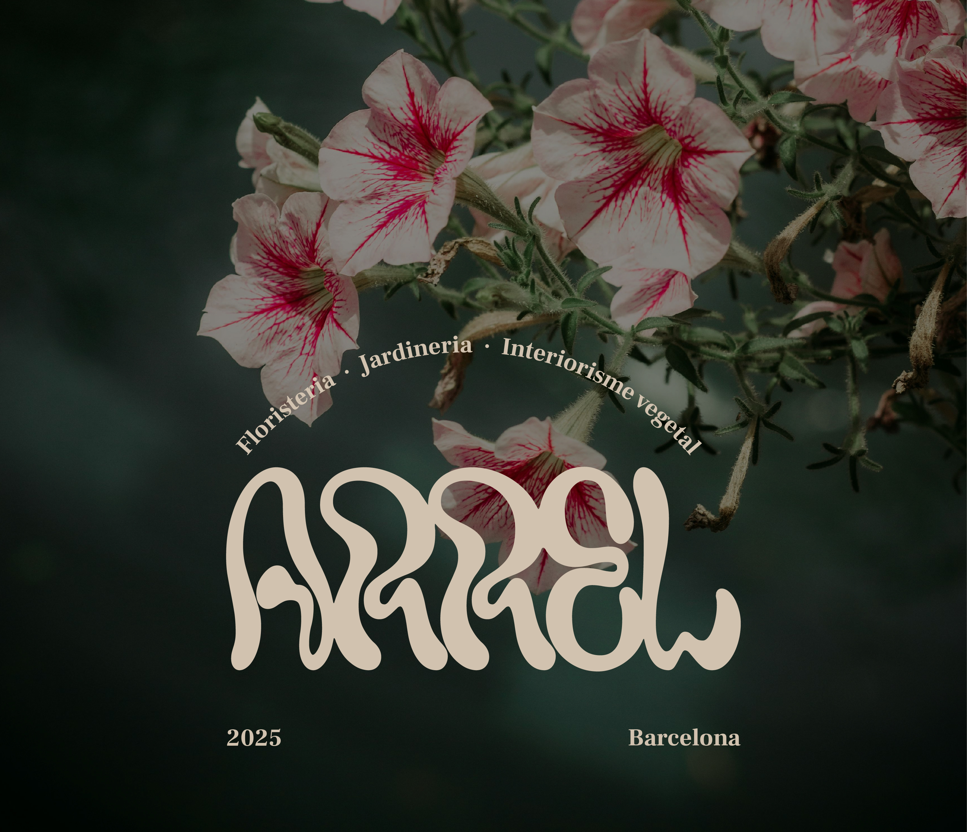
Se trata de un proyecto de identidad visual ficticio para una floristería y centro de jardinería especializado en decoración, de nombre "arrel", en catalán.
Qué se ha hecho: Identificador visual, identidad de marca completa, tarjetas de negocio, patterns, diseño de posts para redes sociales, rótulos de interior y exterior, ropa de trabajo.
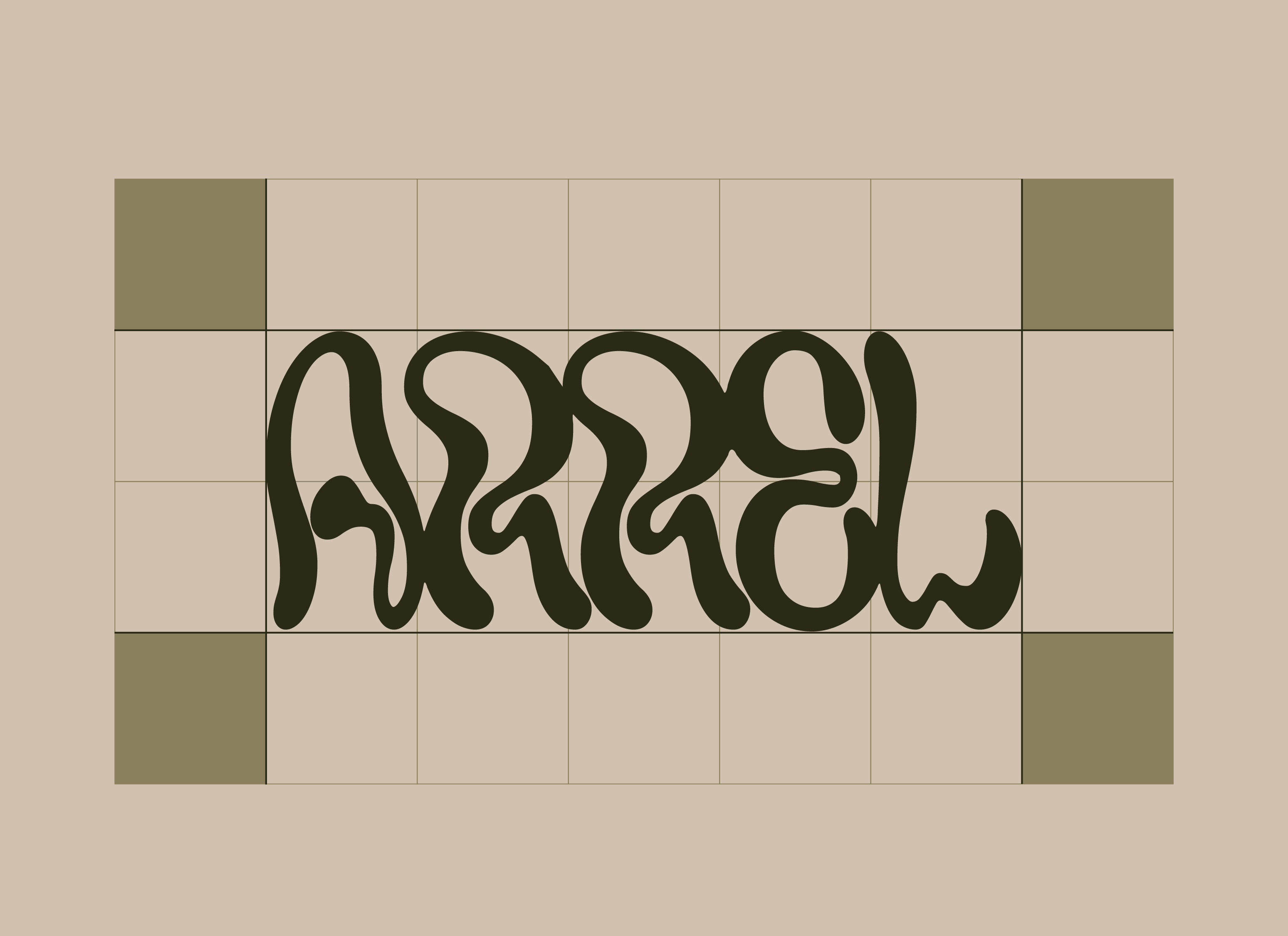
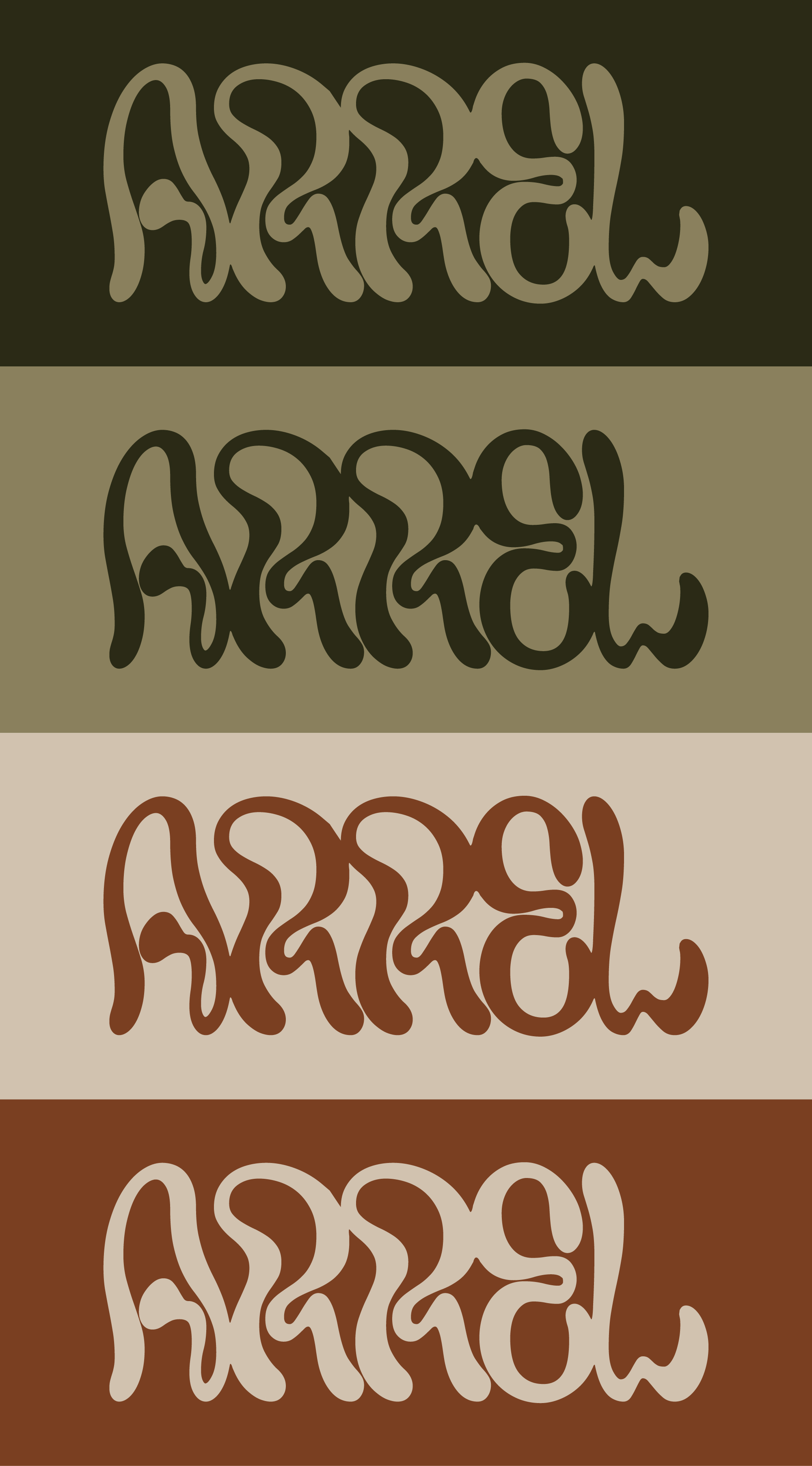
El logotipo está diseñado para parecer que ha crecido en vez de haber sido construido. La tipografía redondeada hace referencia a las raíces y zarcillos, a la vez que se mantiene escalable y legible. Las cuatro variaciones de colores permiten a la marca adaptarse en diferentes superficies y contextos.
La paleta de colores toma inspiración de la tierra — colores verde oliva, terracotta cálido y crema pálido hacen referencia al mundo físico que representa.


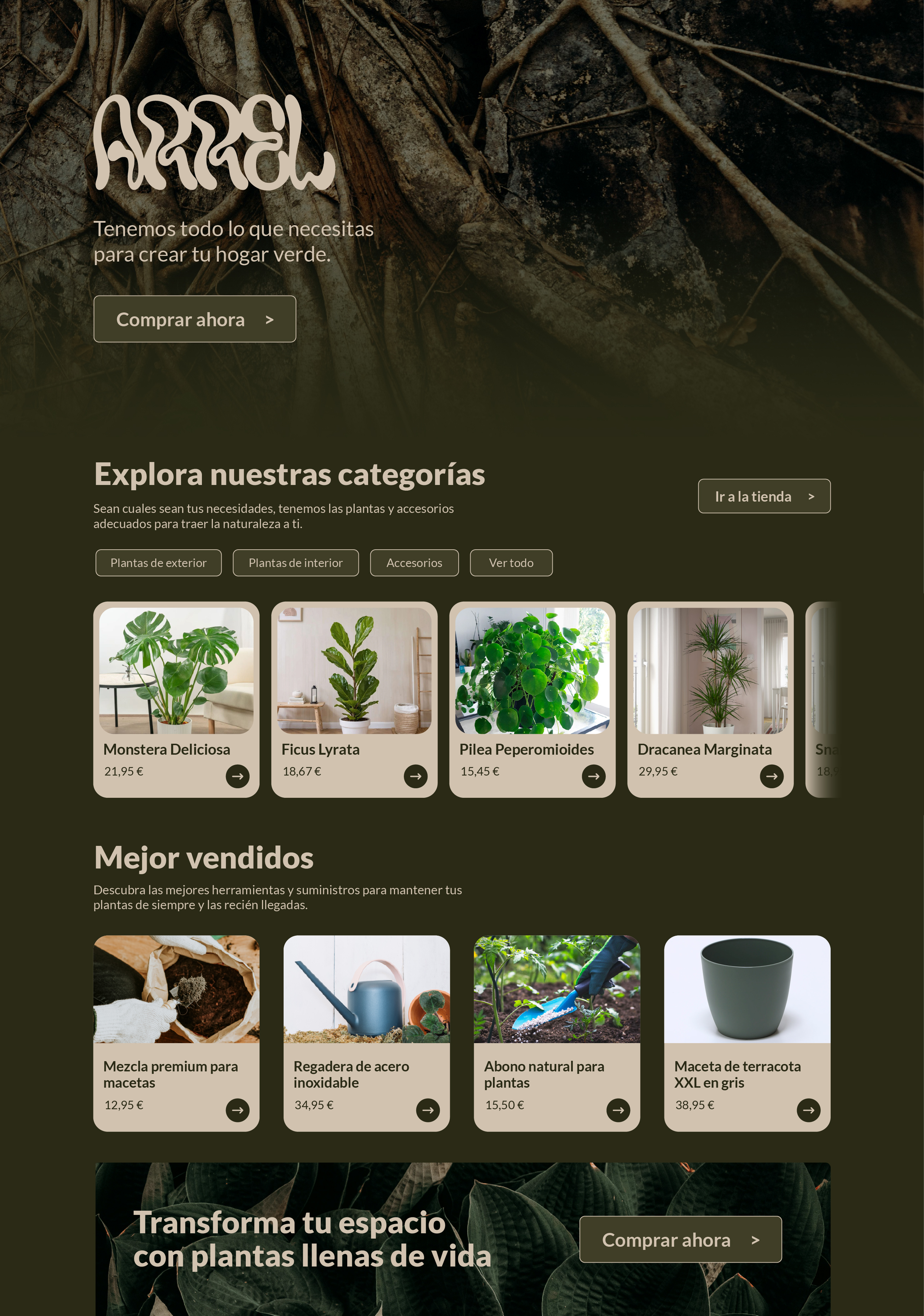
Para la realización de los soportes físicos de la marca, se ha decidido incorporar un entramado de raíces para complementar el logotipo. Estas son finas, delicadas, por lo que no compite con el logotipo. No intenta quitarle protagonismo, sino complementarlo y apoyarlo y complementar el imaginario visual de ARREL.
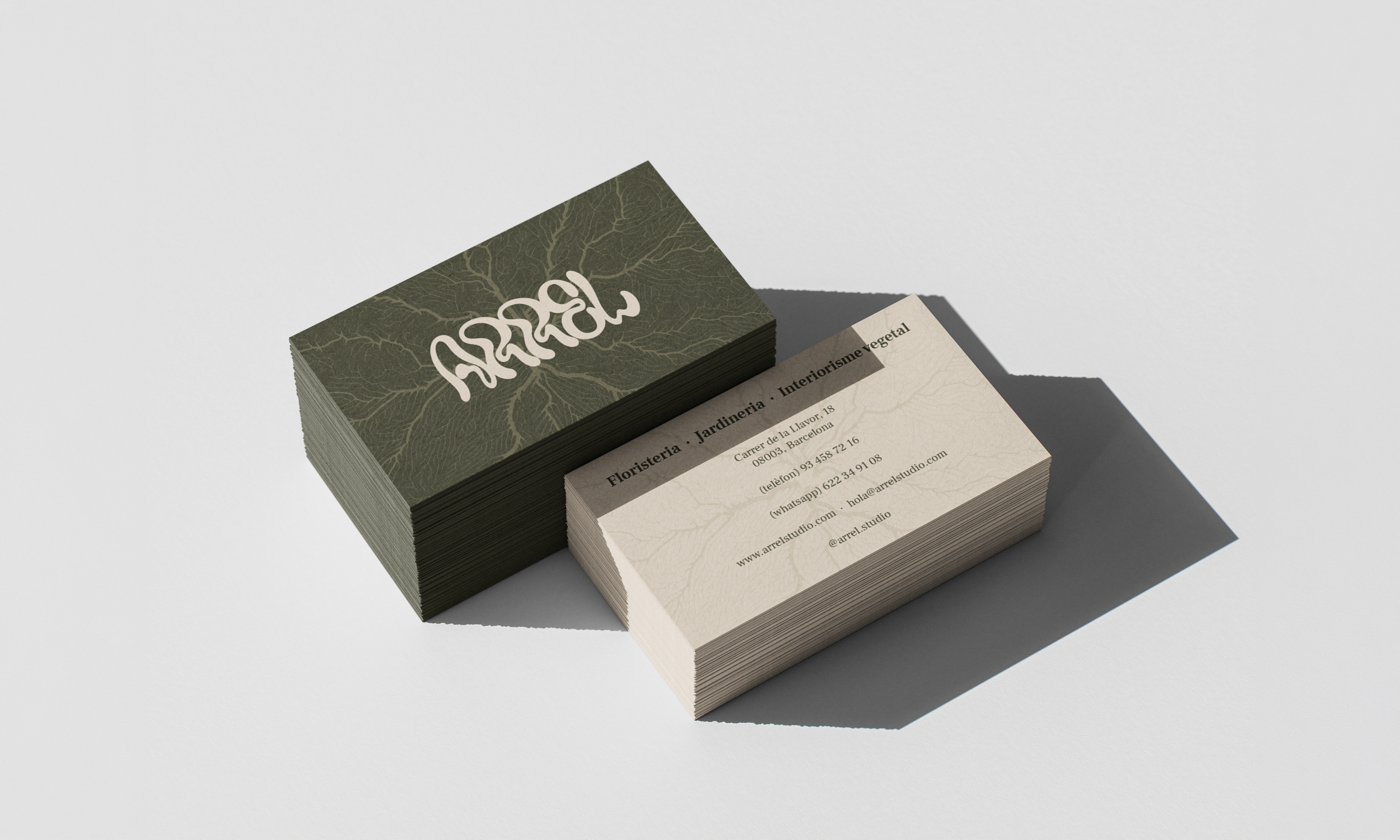
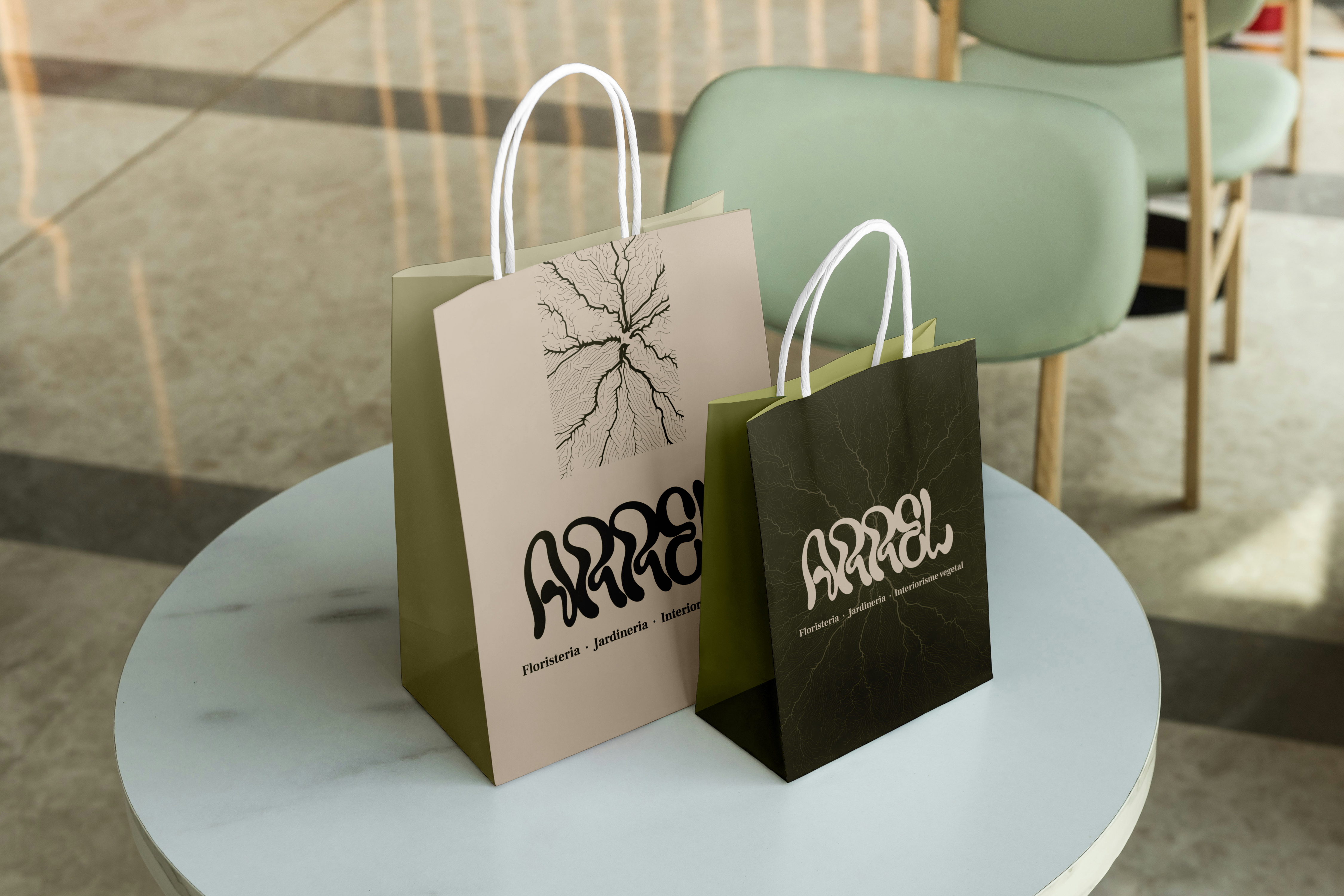
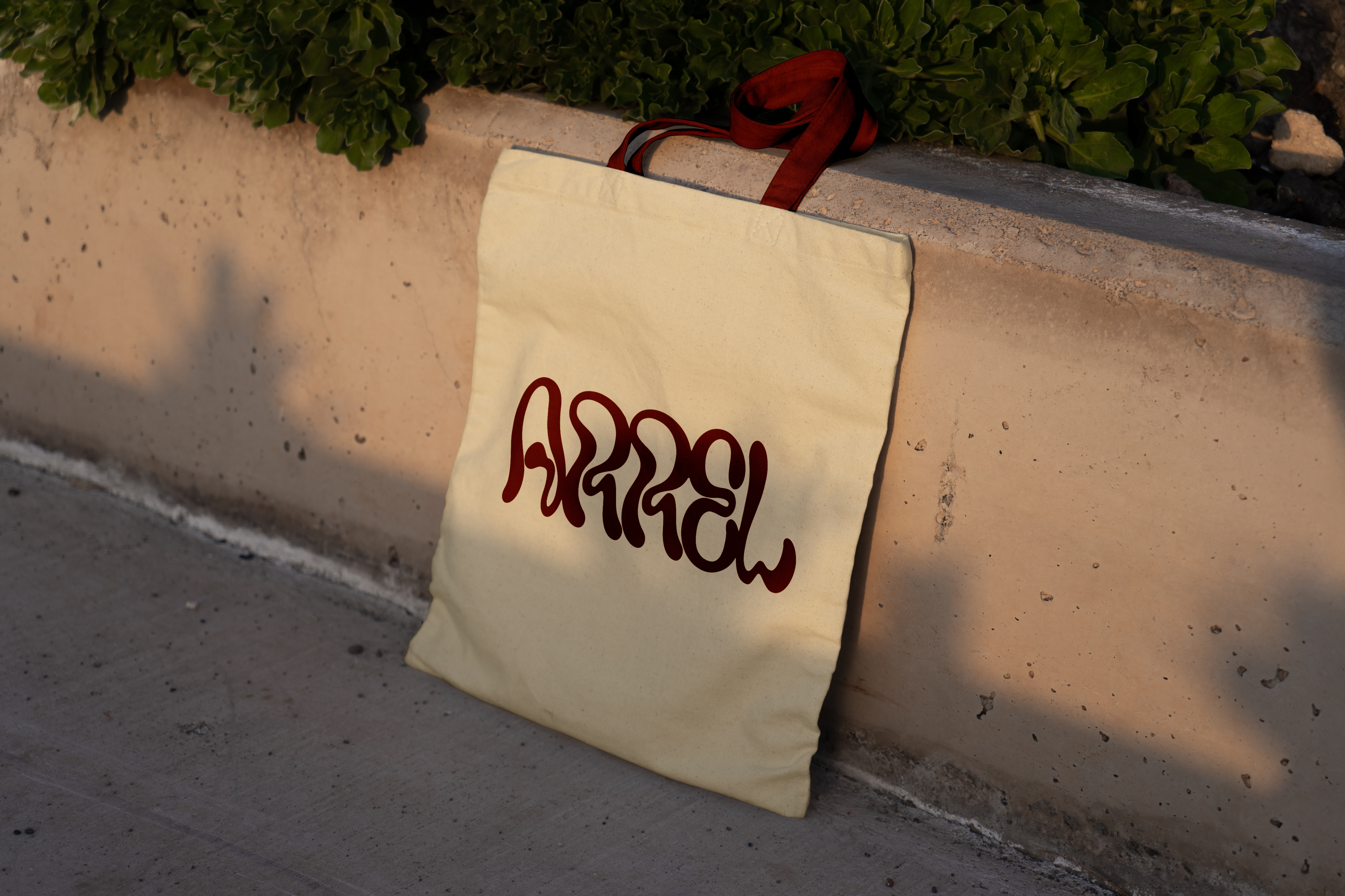
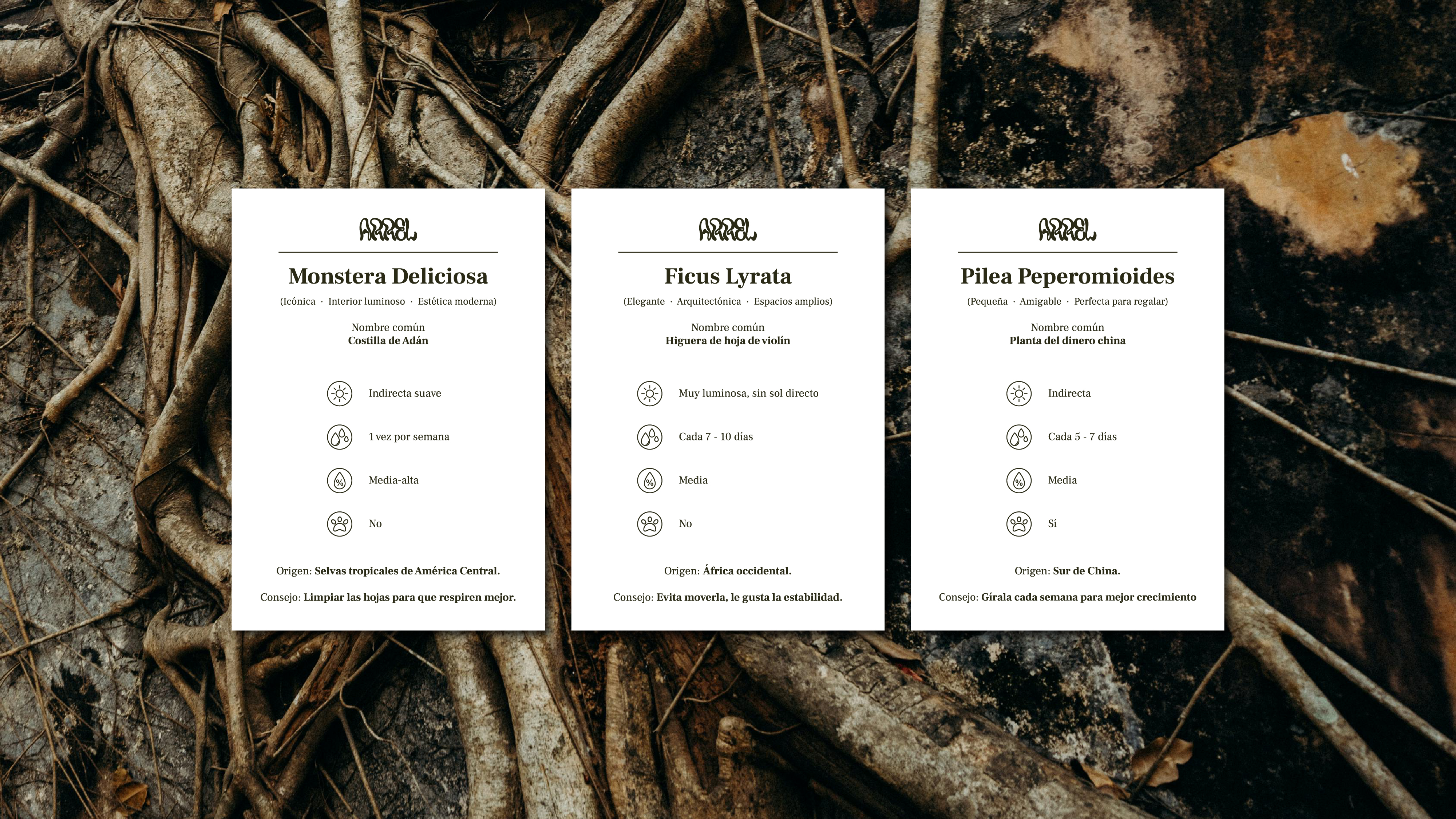
La identidad se aplicó a todos los puntos de contacto: tarjetas de visita con el logotipo en relieve y tarjetas de cuidado de las plantas para especies individuales, un patrón de repetición botánica para embalajes y bolsas de la compra, plantillas para redes sociales que incluyen tarjetas de perfil de plantas, y señalización interior y exterior.
También se desarrolló un concepto de diseño web, que llevaba el lenguaje visual orgánico a un espacio digital con una paleta de colores oliva oscuro y un generoso espacio en blanco.